Enzymedica set out to give Aqua Biome, its line of fish oil supplements, a completely new identity. The goal was to move beyond traditional supplement packaging and create a brand that felt fresh, distinctive, and recognizable across an entire product family.
As lead designer, I helped reimagine Aqua Biome from the ground up, developing a new logo, comprehensive visual identity, and packaging system that brought the brand to life across physical products and digital marketing.
From the first concept to the final production-ready packaging, every detail was considered to create a cohesive identity built for the shelf and beyond.
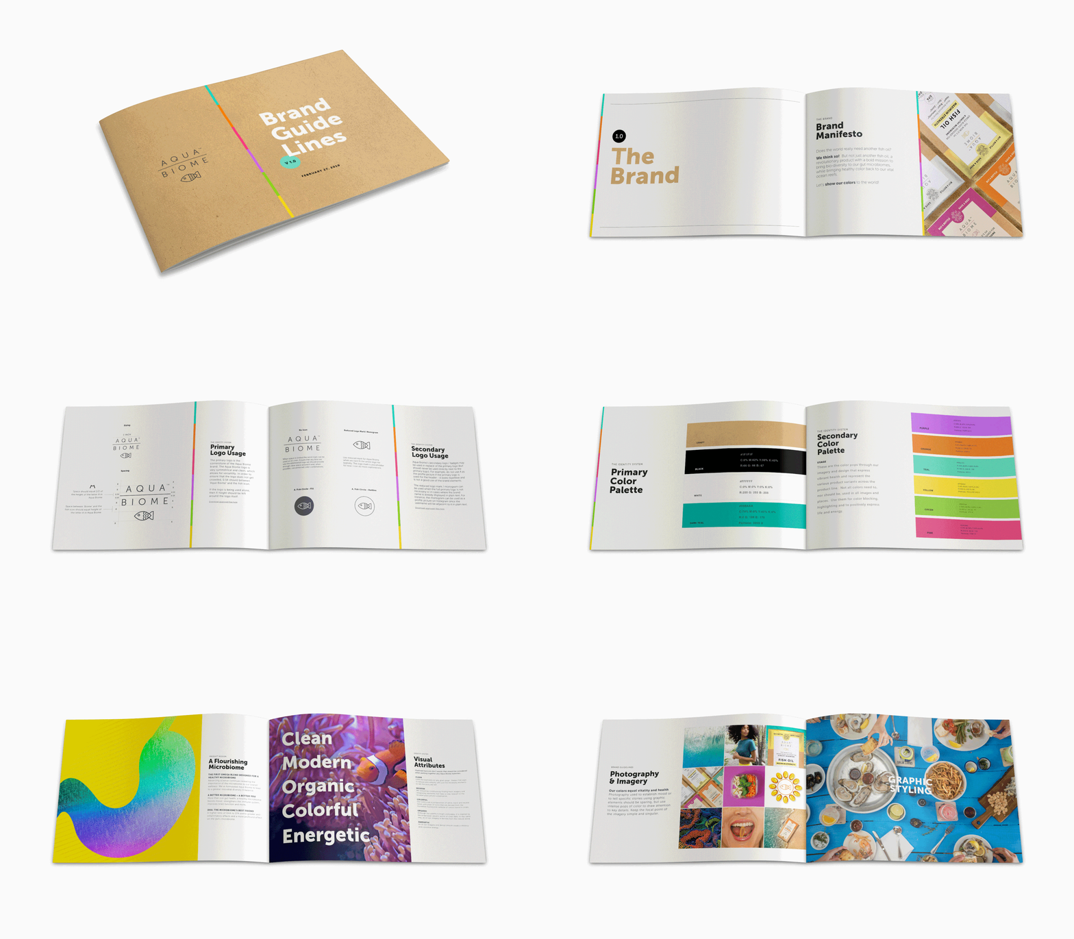
As Lead Designer, I helped reshape Aqua Biome’s visual identity from the ground up, creating a brand that connected its science-backed wellness products to the ocean ecosystems that inspired them. I developed the identity across logo, typography, color, imagery, packaging, and supporting graphic elements, building a flexible visual language that could move seamlessly from print to digital and marketing.
The color palette was drawn directly from the natural diversity of coral reefs, pairing bright aquatic tones with warm, organic textures to give the brand a distinctive personality within the wellness space. From establishing the core design system to translating it across packaging and brand touchpoints, my role was to make sure every detail felt cohesive, recognizable, and unmistakably Aqua Biome, balancing the credibility of a science-driven supplement brand with the energy, optimism, and environmental mission at the heart of the company.

With the identity established, I translated Aqua Biome’s visual language into a packaging system that could grow alongside the product line. As Lead Designer, I created the packaging dieline and developed the design system across each variation, using color to distinguish the different fish oil formulas while maintaining a consistent structure, hierarchy, and recognizable brand presence.
I carried the system from concept through production-ready packaging, making sure every detail worked both individually and as part of the larger product family. I also directed the product photography, shaping the styling, composition, backgrounds, and overall visual direction to bring the packaging to life across digital, marketing, and campaign content.

With the brand and packaging in place, the next step was creating a digital home that could bring the entire Aqua Biome story together. I worked closely with our front-end and back-end engineering teams to design and launch the brand’s e-commerce website, translating the visual identity into a digital experience that felt as distinct and vibrant as the products themselves.
The site was designed to do more than sell fish oil. Customers could shop directly while also learning about the different formulas, ingredients, benefits, sourcing, and the science behind the products. Because Aqua Biome was one of several product brands under parent company Enzymedica, it was important to establish a standalone experience with its own personality and story, while creating a clear, trustworthy path from brand discovery to education to purchase.

Social became a space to expand Aqua Biome’s personality beyond the product itself. I worked closely with our Marketing Director, Social Media Director, content creators, and health and wellness influencers to develop a flexible content approach that could educate, inspire, and build awareness while still feeling unmistakably Aqua Biome.
The creative ranged from lifestyle photography and bold typography to product-focused content and branded collaborations, giving us room to tell different stories without losing visual consistency. Some content focused on educating audiences around fish oil, omega-3s, and overall wellness, while other pieces leaned into motivational messaging, ocean conservation, or simply gave the product and packaging a moment to shine.
As Lead Designer, I helped establish the visual direction across these different content types, creating a social presence that felt varied and energetic while still functioning as one cohesive brand.

